MayFlowers
I created a small branding collection and Twitch livestream overlay for MayFlowers, a variety gaming streamer.

Moodboard A

Moodboard B


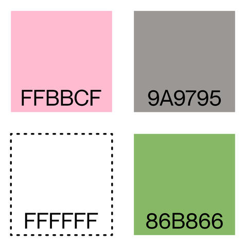
Color Palette
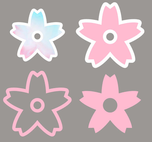
Cherry Blossom Icons


Branding & Identity
The client asked for a chill-out, cozy, springtime-sunset vibe to her assets. She chose Moodboard A (top) between the two I provided, which features warm colors and bubbly, soft type to match her friendly and sweet persona.
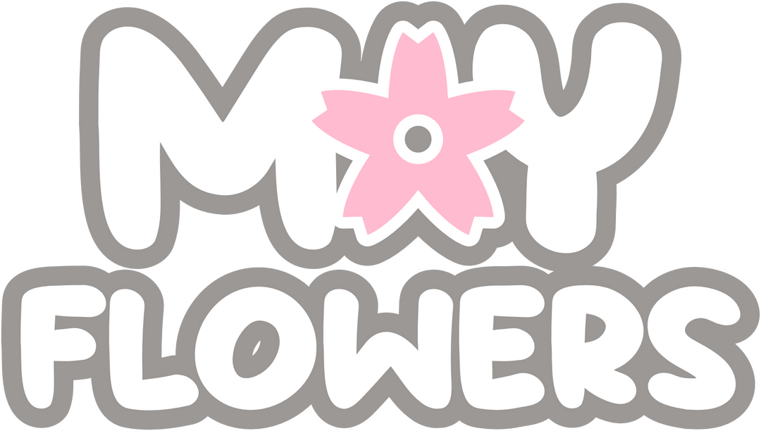
Next, I developed from Moodboard A a color palette (left) from the client's request - pink, gray, and white, with an accent color green. I chose warm versions of all of the colors: a pink that leans toward red tones, a gray tinted with orange/beige, and a green that leans toward yellow tones.To create the logo (above), I presented multiple typefaces to the client sorted into categories, all registered under the Open Font License for her convenience and to eliminate licensing fees.I used the cherry blossom shape that replaces the A in MAY as a brand icon and profile picture icon. The client, a trans woman, is proud of her identity and wanted it reflected in the designs, so I used a blue, white, and pink palette for one of the flowers.The client only requested one typeface for use in the project.
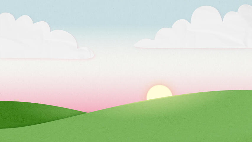
Overlay Background/Main Illustration

Single-Screen Game Overlay
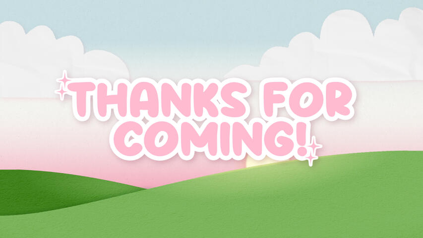
Ending Screen


Twitch Banner

Twitter/X Banner


Pictured (top to bottom): Overlay Background, Single-Screen Overlay, Ending Screen, Twitch Banner, Twitter/X Banner
Stream Overlays & Banners
The client requested a few deliverables for the overlays section of the project: an overlay for a single-screen game, one for a dual-screen game, two for camera-only (with and without alerts), and three status screens (before, pause, and after).First, I presented a few layout options to the client based on her requests and the 1920 x 1080 (16:9) constraints of the Twitch format. After deciding on the layouts, I moved forward with the aesthetics.To begin, I created a vector illustration of a sunset/sunrise over two hills. I used the blue, white, and pink palette from the flower icon for the sky to emulate the trans pride flag, and I added paper textures over the individual pieces of the illustration to give it a papercraft feeling.After the background, I moved onto implementing the agreed-upon layouts on top; the black sections are transparent to allow camera and game video sources through.When these were done, I created the status screens with the typeface from the logo and added sparkle shapes.Banners for Twitch and the website formerly known as Twitter were made with the same background illustration, the MayFlowers logo, and stamps for the cherry blossom icon used in the logo, cropped to dimensions appropriate to each site.
Red Eye Cafe
This is an ongoing personal project. New entries will be added as long as I'm expanding the scope of this brand, so stay tuned for more!

Logo Creation

Wordmark/Font Trials

Color and Wordmark Finalization


Initial Ideas
The idea for this brand came from a prompt list called Peachtober, the prompt of the day being eye. The town I live in is rather sleepy, and nothing is open late, so I had the idea to make a fictional late-night coffee shop for this prompt. I quickly fell in love!Below is my original logo sketch page. You can see that I really liked the boxed-in sketch, which became the basis for the actual logo!To the left are, top to bottom, my logo creation artboard, wordmark creation artboard, and wordmark & color finalization artboard. I had a lot of fun trying out different ideas for the logo and practicing my vector illustration skills! You can see that I took notes on what I liked in all the fonts I tried for the wordmark, but I didn't realize yet that my "favorite" wasn't the best for the job. I decided that Right Grotesk by Pangram Pangram didn't have enough character and went with Rader by Pangram Pangram. I also used Pantone colors for true and complete industry standard compliance.

Sketch Page


Building Sign Mockup
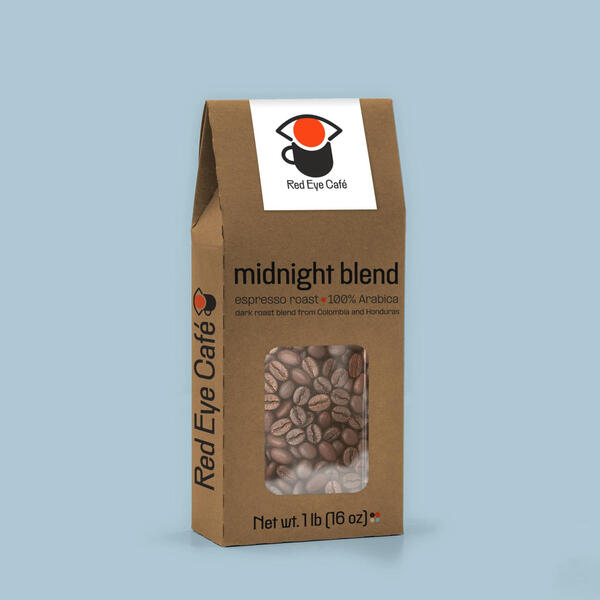
Coffee Beans Mockup


First Mockups
I did a mockup of a building sign and coffee bean packaging first because I feel that they're essential to the Red Eye Cafe brand. As a brick-and-mortar cafe, I wanted the shop to have a sense of place in the world I built for it; as a coffee shop and roaster, they need to be able to sell their beans!This process was simple. I found mockups for the applications I felt were important, then made designs to fit the proportions of the image. Below are the top and bottom half of the front portion of the coffee bean mockup. You can see that I ended up modifying the sticker - I found the cream color distracting and saw an opportunity for spontaneous iteration.

Top of Coffee Bag
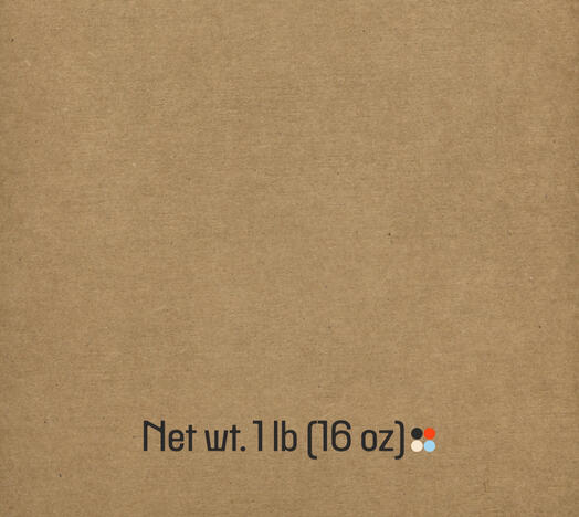
Bottom of Coffee Bag


Email Top Half

Email Bottom Half


Email Mockup
As part of the challenge that inspired the Red Eye Cafe brand, I created an email mockup for the prompt message.I used Figma to design this email mockup, which is an industry standard tool under the Adobe umbrella that gives designers the ability to collaborate on projects in real-time. This was the first time I used Figma, so I took the opportunity to make something simple, boiling down a newletter email to its essentials.You might notice that the icons at the bottom are stand-ins! In these spaces, a company may add any kind of helpful linked icons, so I chose a few that I already had in my assets library. In this space, a client may also want to thank sponsors or partners - it's a versatile end-card that can be modified to hold nearly anything.I made sure to use colors that came from the brand palette, and I found that the light blue color I chose was good for displaying black text while still being different enough from white that it would function as a container. This blue is usually an accent color, so I appreciated the chance to use it as a feature tone!
![Motion Sickness]()
Motion Sickness

Sadie's Opossum Squishmallow
!["Here Comes the Sun" by Bill Wurtz Tee]()
"Here Comes the Sun" by Bill Wurtz Tee
![Chill Pill]()
Chill Pill
![John My Beloved]()
John My Beloved
![What Paper Texture?]()
What Paper Texture?


